A Good Infographic Has These 5 Essentials
Why Infographics are Important
Infographics share information and data visually, allowing users to digest the message quickly and clearly. Below we’ve included some statistics on why infographics are important and why you should use them.
- Infographics can increase website traffic by up to 12%. (One Spot)
- Infographics are 30 times more likely to be read in their entirety than blog posts or news articles. (Digital Information World)
- Web articles that contain images receive 94% more views than articles that don’t. (Jeff Bullas)
- Buyers understand infographics more since 90% of information transmitted to the brain is visual, which can improve learning and retention by 400%. (Forbes)
- Infographics are liked and shared more than any other type of content on social media. (NN Group)
- According to Google trends, infographics search spiked in 2010. (Google)
- Infographics are still relevant since users typically read only 20% of content. Including infographics helps keep readers and non-readers engaged. (Mention)
Do you want to learn how to create infographics? An effective infographic has five must-haves. This beginner’s guide to creating the best infographics highlights the five key essentials.
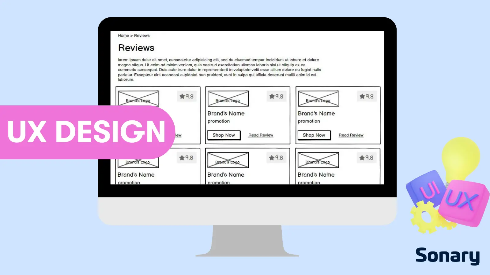
Best Graphic Design Software & Tools


 Smart object integration for scalability
Impactful blending modes and layer styles
Smart object integration for scalability
Impactful blending modes and layer styles  Built for easy team collaboration
Internal content scheduler and publisher
Built for easy team collaboration
Internal content scheduler and publisher  Budget designs available
Robust search and filter feature
Budget designs available
Robust search and filter feature What Is An Infographic?
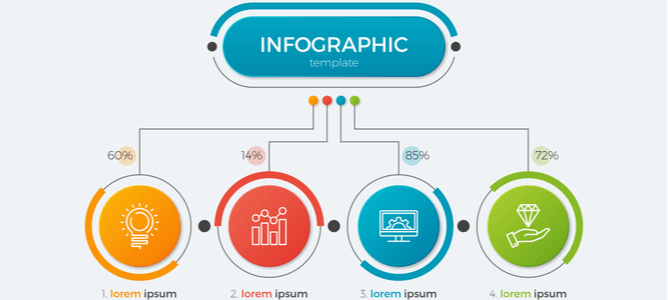
An infographic is a visual way to represent information. By using graphics, icons, and other visuals, infographics make complex data more digestible and easier to understand.
The Importance of Data Visualization
Data visualization is a critical part of any infographic. When choosing what data to visualize, ask yourself: what is the most important information that I want to communicate? And what will best help my audience understand this data?
Once you’ve chosen your data, it’s time to start visualizing it. When creating your visuals, keep in mind the following:
- Use simple and easy-to-understand visuals
- Use contrast to make your visuals pop
- Use visual hierarchy to guide your viewer’s eye
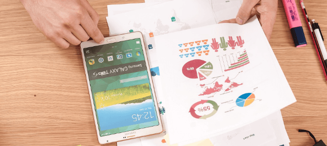
 Wallusy from Pixabay
Ready to start creating your infographic? Information designers suggest following these five essential tips:
1. Use A Headline Directed Toward Your Target Audience
Successful infographics use headlines that are directed toward their target audience. A headline will have a key message that the target audience will want to know. A successful infographic headline will also include keywords related to the data being visualized.
2. Be Concise
Any written content in an infographic should be well-written and concise. The copy should be free of errors and easy to read. After all, an infographic aims to be primarily visual in communicating its message.
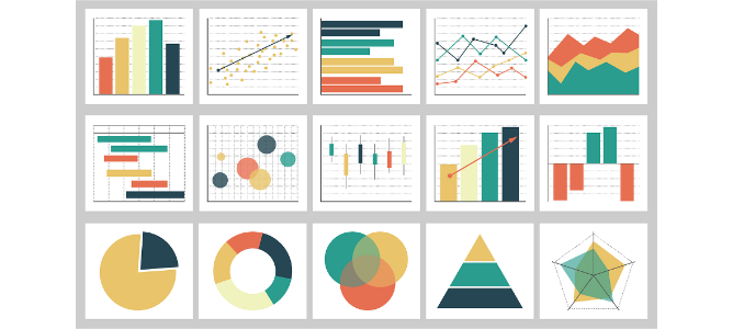
3. Use Eye-Catching Graphic Elements
Visual content is what makes an infographic effective. Graphic design elements should necessarily include data visualization in pie charts, line graphs, venn diagrams, and the like to help to break up the content and make the information easy to understand. But how the visual information is presented matters too.
Fonts, colors, and other design elements should have a cohesive and memorable look to make the infographic visually appealing and, ideally, shareable.
 Firmbee from Pixabay
4. Plan the Infographic Design and Layout Well
The layout of an infographic is important to its success. The layout should be clear and easy to follow. All of the elements should be placed in a way that is easy for the reader to understand, and it should tell a good story.
Avoiding white space and using negative space effectively can help to make a layout more visually appealing. Making infographics that are too long or too short can be off-putting to readers. Templates on sites like Canva and Visme can be a useful starting point for creating an infographic.
Related Articles


5. An Attention-Grabbing Call to Action
A great infographic will also include a great call to action, whether that call is to learn more about the topic, to share the infographic with others, or to sign up for the service or product the site owner is offering.
Infographic Good Design Guidelines
By following these five tips, you can create infographics that are informative, visually appealing, shareable, and action-generating.
Sonary offers reviews, facts, and comparison tools to help you pick the best software for creating infographics and other graphic design materials.