The 7 Most Common Graphic Design Mistakes and How to Avoid Them
The dynamic and modern age of graphic design is here to stay and thrive. The fact of the matter is that impressive visual content is crucial to drive success for any business. Unfortunately, most startups don’t make design part of their marketing strategy and ultimately lose their customers.
Did you know that more than 90% of the first impressions are associated with graphic design? It is no wonder the U.S. graphic design industry alone is worth more than $15 billion. In fact, almost 70% of small businesses are open to pay over $500 for a high-quality logo.
As a brand, even if you decided to prioritize graphic design, the last thing you want to do is generalize various elements of graphic design. Whether you want to post visual content on your blog, social media platforms, email marketing campaigns, or website, it takes a creative and personalized approach to understand to win over the target audience.
Why Graphic Design Mistakes Matter
As a startup business, you may not be aware of it, but a single graphic design mistake can create a negative perception of your company. The same perception can cost you more money down the line. But a well-thought-out graphic design approach can help you capture the attention of the target audience and build long-term relationships.
Did you know? More than 90% of the first impressions are associated with graphic design?
Keeping that in mind, let’s look at the seven (7) most common graphic design mistakes you can avoid:
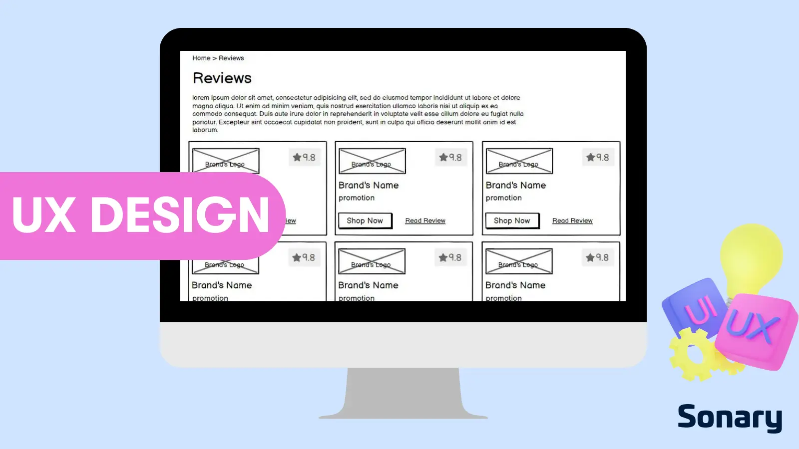
1. Compressed Design
Startup businesses often have the tendency to include excessive visual elements in a design. It makes sense why brands would want to fit more information or fill empty spaces. But you’d be surprised how many times this approach backfires.
Just because there’s a blank space on the design doesn’t mean you have to fill it out. So, focus on a clean, minimalist, and sophisticated design that can do wonders for your brand. Opt for high readability and divert the attention of your audience to a few specific visual elements.
With simplicity, you can keep your worst graphic design tendencies at bay. For instance, it would allow you to not use a complicated color palette that may complicate the entire design. The same rules apply to font styles, emphasize specific headlines rather than add a lot of text.
2. Complex Iconography
Icons allow graphic designers to convey the core message through illustrations or small symbols. But often brands end up using inappropriate or unidentifiable icons that make the core message difficult to consume. You have to understand that icons are an essential aspect of modern mobile interfaces.
In fact, when it comes to apps, your icons serve as buttons. If you don’t want to pick the wrong icons, you have to think of the icons as a way to tell the story of your brand. The right visual icons can correspond to a specific visual meaning. In the end, just make sure your icons match the UI style.
Also, avoid free icons that are not good enough to make a good first impression. Instead, use icons that make your design look tidy and compact. You can cut out more issues by ensuring that the line width, corner radius, corner shape, and line shape of the icons are in the right order.
3. Excessive Use of Different Fonts
Anything you plan to use excessively can compromise the uniqueness and beauty of a design. But when it comes to fonts, you have to be more cautious and use fonts that are can convey the information without being distractive.
Now, it doesn’t mean you cannot use multiple fonts. Instead, make sure the differentiation of fonts doesn’t discourage the reader to review the information. Your use of various fonts should be practical and appealing at the same time.
But many startup businesses use different font shapes and sizes that compromise the core message. Just don’t forget about typography and make sure your used fonts spark the right emotional resonance with the audience.
Related Articles
4. The Constant State of Overthinking
Of course, small details matter, but it doesn’t mean you have to ponder over every single element of your design. Maybe you’re a perfectionist, and that’s fair but don’t lose sight of what matters to your target audience. It means “design” rather than imposing “design” that may not work out.
In any case, don’t dwell too much on one specific design or object. Instead, continue to improve the design and make sure it would work for a particular target audience. You may feel tempted to change the color, font, or border repeatedly, but it would create more design problems down the line. Your goal should be to examine the overall appeal of your visual design rather than a single element.
5. Use of Stock Images
Just like most businesses, you also want to save additional costs and opt for free stock images. But the fact remains that conventional stock images come with a lack of accessibility. There is a good chance the image you want to use has already been used by many brands.
almost 70% of small businesses are open to pay over $500 for a high-quality logo.
Even if you don’t use mainstream and free stock images, you may not be able to make a desired impression on the users. Unlike custom images, people have had the chance to see many stock images. So, don’t use stock images that might bum out the audience to review the rest of the information.
But if you plan to use a few stock images, look at those pictures through the same lens as spelling mistakes. Your strong grammar helps you communicate the visual content and render specific marketing campaigns. So, make sure there is no image that feels out of out of place or demonstrates a lack of confidence.
6. Spacing and Padding Issues
Suitable spacing and padding make your layout clean and allows readers to check information without issues. On the other hand, small padding makes it harder for the readers to break down the information into blocks. So, it makes sense to include bigger space between chunks of information.
However, make sure the same-size content spaces make logical sense on the left and right sides. Remember that uneven spaces will make your visual content look messy. The trick is to pay close attention to each section and ensure visual hierarchy. It means padding between separate content blocks must be bigger than the padding between text and heading of each visual block.
7. Design is Not Compatible
Brands often don’t align their design with a suitable cross-platform. Compatibility matters because modern users have the freedom to access information from a tablet, laptop, or mobile device. Most beginner graphic designers tend to forget about the importance of compatibility.
For starters, make sure the design is optimized and compatible with mobile devices. At the UI stage, you should have a mobile-first strategy to optimize visual content. If you want to achieve a high degree of compatibility, make sure that every user will be able to see the design. For instance, brands often choose UI elements that work for desktops but not for mobile devices. Therefore, make sure the visual
Best Graphic Design Software & Tools
 Smart object integration for scalability
  Impactful blending modes and layer styles
  Built for easy team collaboration
  Internal content scheduler and publisher
  Budget designs available
  Robust search and filter feature
 So, What Makes Up the Modern Graphic Design?
Today, graphic designing revolves around a multitude of aspects. Essentially, modern graphic design captures the essence of a brand image and makes it easier to promote business. In the digital age, there are more than enough graphic designing tools and tactics to create more opportunities.
What’s interesting is that you don’t necessarily have to be a professional graphic designer to understand the basics. So, if you’re not a graphic designer, you can figure out the fundamentals to create an attractive brochure, business card, or logo on your own. But the ideal approach would be to seek the services of a professional graphic agency that understands that changing dynamics of visual content.
Adapt an Optimistic Approach
Whether you’re a professional or a beginner graphic designer, you cannot lose hope. In fact, you have to be optimistic to create a wide range of designs. And that’s because negative feedback and a cynical spirit can suck the enthusiasm and value proposition out of your brand.
In the end, all graphic designers strive to achieve perfection. But even if you’re new to the visual content landscape, it is better to be aware of the most common graphic design pitfalls and how to solve them before things spiral out of control.
Wrap Up
It would be fair to state that graphic design is more than just a combination of appealing visual elements. With the advent of graphic design tools, professional designers can push the creative boundaries and craft majestic designs.
The fundamental approach to avoid common design mistakes is to focus on “your” design process. From color choice to fonts, each visual parameter reflects the psychological preferences of a specific target audience. Your objective is to live up to those high expectations and make a long and lasting impression.

